


Before you scroll down, please be aware.
In this project, I'll be laying it all out – my origin story, ideals, what makes me tick, and why I created a brand in the first place. Originally, I just wanted to showcase the new design and philosophy behind it, but the whole project quickly turned into something different – a sort of story.
The TL;DR; legrandblond, or 'the tall blond' in English, was originally just three words students used to describe me. It became my alter ego across social platforms, and title slide for my design porfolio. But , as life happens, I found the courage to embark on a new journey and with it, legrandblond needed to become something more – a real brand.
But as good stories go, let’s start at the beginning.
My sort of origin story.

It all began back when I was a student at the Hamburger Akademie. I found myself as one of only two students named "Niklas." Throughout my life, encountering another "Niklas" has been a rare event, let alone having one in close proximity for approximately three years. The Akademie wasn't a big school, and as we regularly discussed, reviewed, and referenced the works of our fellow students, it became crucial to differentiate between the two Niklases. Since everyone operated on a first-name basis, there was a need for clarity. Fortunately, one obvious distinction came to our aid. So, when conversations revolved around me or my work, and the question of which Niklas was being referred to arose, the answer was straightforward: the tall blond one.

During that chapter of our story, the prospect of freelancing post-Akademie was a frequent topic among us students. Naturally, it crossed my mind as well. I mean, who wouldn't be enticed by the idea of handpicking projects, collaborating with various brands, and constantly interacting with diverse groups of creatives, personalities, and clients – maybe even globetrotting around Europe or beyond. However, by then, I already gained some firsthand experiences as a working student in both a small two-person agency and a larger production house. I genuinely valued the stability of monthly paychecks without constant concerns and the chance to learn from more senior creatives. Consequently, the notion of starting my career as a freelance creative took a back seat, and upon graduation, I opted to secure my next paychecks within renowned agencies. This decision aimed at further refining my skills, utilising my talents, and contributing to a variety of projects, clients and pitches.
What’s your name again?
In real-life encounters, I tend to leave a memorable impression—as far as I know most of the time for positive reasons. Being somewhat charismatic and clever, are probably the main reasons why. However, to get your foot into a meeting room at a big agency yo u need more than just good banter; an invitation is needed. For creatives, the golden ticket to such an invitation is their portfolio. Unsurprisingly, my initial portfolio lacked the natural alure of my IRL persona. It was brimming with the same basic student projects and designs that every student showcased. I needed a differentiator, a charismatic "remember me" factor that stands out from the deluge of applications agencies receive on a daily basis. Something that translates not just me as an individual but also as a creative—a means to avoid being just another applicant. Just like in the Akademie – I needed something that lets others easily recognize me.


When you google "how to land a job in the creative sector" , you'll find a myriad of unconventional approaches to stand out and snagging a position at a prominent agency. A classic favorite of mine is the loo-paper portfolio. However, I didn't opt for a media worthy stunt like that. Don't get me wrong; I enjoy the limelight and the attention such coverage would attract. Being at the center of a conversation is a spot I don't mind occupying, but I will never forcefully take it. That's just not my style. I'm not naturally flashy; I lean towards subtlety. So, after a bit of pondering, I approached my problem from a brand & design perspective —I wanted something catchy, with a nice ring, that naturally evokes interest but still represents me. I did what brand designers have done for years: I embraced the one thing people already used to define me and explored it. Turning a simple descriptor, it into the name of my own personal brand name. I mean, why not? I was a tall, blond guy - so obviously legrandblond was a perfect fit. By the way; before I decided on my brand name, I used "skinny sailor" as my alter ego. Also based on first-sight descriptors of myself at that time, but as it turns out, "width" is not as timeless as "height"...
Blond. Le grand blond.
The "tall blond one" is a pretty straight forward brand name. Why is it French, though? Do I speak French? Nope. Do I have a special connection to the country? Nah. Am I drawn to the French philosophy of life and design? Not that I am aware. The honest truth? I liked the sound of it. I always worked with international clients and colleagues, so German for my personal brand was simply never even considered, and while I love English for brand names, it didn't quite have the ring and vibe I wanted for myself. After some unsuccessful dabbling in Latin (yes, the dead language), French emerged as the winner, and honestly, I never questioned it again. "Le grand blond," just felt right. The words have a nice flow and sound, exuding a certain vibe that can't be directly defined—a bit edgy, a bit posh, a bit cheeky and anything in -between. It just sounds like a brand and even though it's French, it feels Hanseatic and Nordic at the same time. I just vibed with it, and in a room full of people, there's a proven high probability that, without knowing me, folks will instantly think, "that's you!" – but that's a story I'll gladly share another time or over a coffee or two. So, lets take a look at the first design, from way back.

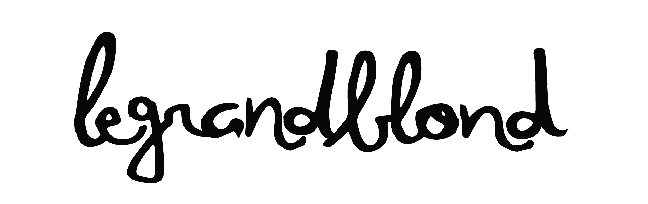
The initial version of my personal branding was basically nothing more than a rough-around-the-edges hand-lettering font with really questionable kerning – without any alterations. Because, at the time, I saw no need for it to do more. It was meant as a door opener, a wordmark for a brand that did not really existed, for a young and hungry creative who wanted to get into the advertisement world not for fame or fortune, but out of passion for the work itself. And after I landed my first gig, I never bothered to develop or revisit the design – I just started to use it wherever I created an account or had the chance to use it as an alter ego instead of my real name. And it stayed like this for almost ten years – until 2020 happened.
The big “C” word.
Let's address the elephant in the room called Corona. And no, I'm not talking about the tequila-flavored beer. Rather, the global pandemic that had everyone reevaluating their lives while trying not to go insane. Don't worry, I'll keep this part of the story as lighthearted as possible. So, how did I cope with the stay-at-home and do-not-meet-people new normal that everyone was thrust into? It was actually super easy, barely an inconvenience.
For the most of my career until that point, I always were a "lone wolf" on projects. Partly, because of budget decisions and partly because, I developed a unique toolset of skills that let me function as a one-man-agency of sorts. I always found myself, for longer stretches of time, single handedly taking care of all the art direction, copy writing, strategy, presentation building, presenting and client service aspects for a project – sometimes until "people were available again", but to a certain degree because everybody knew I will get it done. Not that I officially had free rein, of course, but various creative directors and CCOs I worked with early on realized that "the longer my leash, the better I performed. Thus, the better the result." This workflow became both my sweet spot and my Achilles' heel. I thrive on learning, adapting, and creating internal synergies between different disciplines. It keeps my mind engaged and thinking multiple steps ahead. I never stopped at point X and said, "That's your problem now." I always loved to be part of the ongoing conversations, be heard, be helpful, and learn from my peers. But I detest when the work and ideas I put into a project get brushed aside because "I am just the Art Director." So, transitioning my work-life to that of a creative hermit, alone in my home office, having only my thoughts to converse and brainstorm with, was a breeze. I wasn't completely alone though; I had my now-wife and our two cats around, doing the heavy lifting of keeping me sane.


Before the world hit the pause button, I had the pleasure of being part of some really cool productions over the years. Most of the time, I was a key player in the lead creative team or the sole creative supervisor for these projects. It's no surprise that I developed a quite deep theoretical understanding of the skills required to be a photographer and videographer. As always, I didn't want my ideas to be brushed aside—being able to "talk the talk" on a somewhat level playing field, tends to make people more open to listening. And I have fun consuming everything there is to know about a topic on a theoretical level, has always allowed me to train my mind, or in this case, my eyes to become better equipped to take the creative lead in any situation, if needed.
However, here's an interesting tidbit: until I turned 33, I had never owned or operated a professional camera in my life. I never thought I had the "talent" for it, but as a way to cope with the isolation and have a reason to take a "walk outside" – I took up photography. It became a new creative outlet amid the chaos and fears of social isolation—a fresh way to spend my days wandering around Hamburg and snapping pictures. Initially, I documented the everyday moments of my life, now-wife and cats, then pushed myself to understand and learn about different styles and categories. Eventually, I developed my personal style, a blend of street and documentary photography, mostly black and white with a splash of color here and there. Photography quickly became one of the biggest passions in my life, alongside fantasy role-playing games and my family. Why am I telling you all this?
Let's get back to the main story, to find out.
The day that actually changed everything.

The 8th of June 2023, is the day that changed my life - in any way, shape and form imaginable. At exactly 06:26 in the morning, I officially joined the dad club. Suddenly, I had a whole new set of responsibilities and a boatload of unexpected expenses. Cue the endless bills and the need to buy things I didn't even know existed. With my wife staying home and me working mostly from home to support as much as I can, the idea of freelancing popped back into my mind. Just on the side of course —not to be a globe-trotter, but to give our finances a boost and ease the load of our shoulders. I already had the groundwork for a personal brand that could serve as my freelancer's calling card, not to mention now a decade of experience that fine-tuned my skills as a creative and offered some business options. Yet, with greater skills comes greater clarity—what I was missing was the essence, the core (and now business) idea behind "legrandblond." What exactly is legrandblond? What am I actually offering? And what are my unique selling points, besides a cool name?
I am just another blond guy, who can’t do (kick)flips.
When it comes to brands, authenticity and identity is key. No fake vibes, no over-selling— keeping it real should always be the way to go. So, when I decided to revisit and, in the process, redesign my personal branding, hitting both those things was at the forefront of my goals. There was just one problem, I had no idea what was truly, authentically me.
To crack this philosophical code, I embarked on an adventure down memory lane. I scoured through my past creations—university presentations, random artworks, experimental projects. Starting from my 13-year-old self discovering Photoshop, crafting wallpapers, and first ventures into graphic design and branding for browser games or Counter-Strike 1.6 clans. Scavenging hard drives, social media, and dormant profiles across the web, I uncovered recurring design elements. Three consistent themes emerged from my ventures: a fusion of digital and analog, a commitment to storytelling or capturing attention, and a love for incorporating elements like grunge, grain, or textures. In essence, I thrived on intentional experimentation, crossing styles with the goal to evoke emotions.
While a single image can speak volumes, give me a thousand words, and I'll definitively spin a good story. Writing has been a longtime passion, from teenage poetry to stabs at songwriting in a rap group and later a rock band. Even today, I continue to write for work and pleasure, coming up with creative concepts, headlines and manifestos or crafting background stories for my fantasy role-playing games at home. Though I may not label myself a professional writer, who knows what the future holds. Maybe, one day, I'll venture into writing a novel within the rich tapestry of my own fantasy setting. The journey is ongoing, and the possibilities are truly limitless.


Btw, if you are still here and reading: thank you.
All that is left is the actual redesign of the brand – and the part about my business idea.
You should probably get a snack or two before you continue, there is still a bit reading to do. You Ready? Let’s scroll.

A question of character.
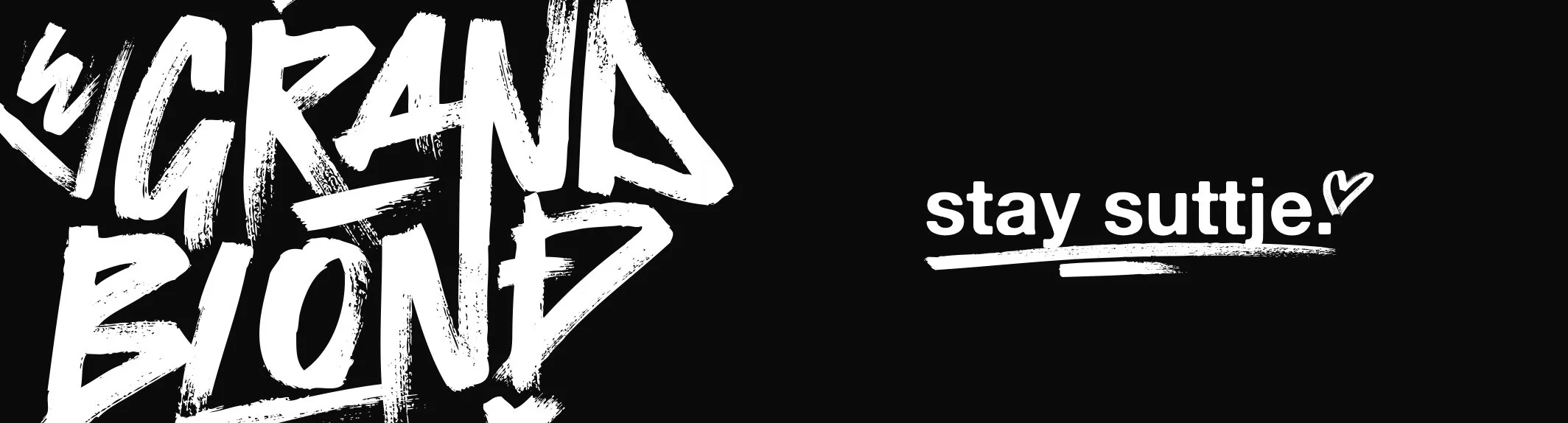
After soul-searching and introspection, my brand's character became clear. A decade ago, Adobe Illustrator birthed my logo, and while the original design and typeface held sentimental value, I yearned for a more grown-up, professional, and inherently "me" feel. Enter the star of the redesign: Alte Haas Grotesk Bold. A favorite typeface, it exudes a subtle, printed ink-like feel—bold, yet soft, modern, with an analog touch. I compacted the name, adjusting kerning, possibly concluding the redesign a decade ago. But my personality craved an extra dash of character—a unique human factor turning words into a true wordmark.
The decision to use a marker typeface to accentuate the start of each word was instant, inspired by my wilder, rebellious teenage years and the old logo. After toying with digitizing my own handwriting, I discovered Atomic Marker Regular. This graffiti-esque typeface offered the right touch of roughness and character, with expressive alternates and doodles, matching the organic softness of Alte Haas. It felt right and spared me the debate with my wife about transforming a room into an art experiment space. Because why overcomplicate things when simplicity works?


The next step in my redesign was choosing the right colors that best resonate with me and my vision. Which wasn't a drawn-out process. I just aimed to capture the essence conveyed by the new wordmark – my blend of digital and handmade craftsmanship. The starting color on my palette was a deep black ink infused with subtle hints of blue. To offset this cold darkness, I opted for a soft, slightly off-white shade, avoiding pure white, as the secondary base colour. To disrupt this black and white feeling, I needed accent colors – vibrant neons that don't quite reach the neon spectrum. The primary accent, Accent-Blond, is inspired by the typical text marker and my hair color. In situations where Accent-Blond might not work, I have Accent-Blue. A true complimentary pairing, with peculiar hues that feel almost a bit off, yet exuding a cool and modern vibe.


For some weird reason, finding my personal "just do it" became my next priority for the rebrand. I wanted a slogan that could encapsulate and convey my life philosophy and work ethic as a creative-for-hire at a glance. However, defining a brand's position in a single sentence or claim is no walk in the park. Corporations invest significant sums in agencies to develop their brand identities, and I've weathered my fair share of feedback cycles from hell being part of that process. Fortunately, this time around, I only had to please myself rather than some corporate swarm mind. One burning question remained: Could I nail down that one perfect statement for my brand?

As my search began, I did kinda repeated what I did with the redesign itself. I used my personal life to look for various assumptions and ideals I held about life, work, and creativity in general – and tried to formulate claims out of them. At first, almost everything I came up with felt either too forced, too shallow, not like myself or like uninspired echoes of existing claims. In a nutshell: nothing clicked. Typically, when faced with such a dilemma or creative block, some might get stressed or halt the process. Not me. I shift into overdrive, thriving amid uncertainty, swiftly exploring multiple options and scenarios in my mind until I find a solution. Most of the time staying pretty calm, while seeking that silver lining. But we all agree that "staying calm" is no "just do it." Hamburger Schnack was a nice way to elevate the otherwise mundane and generic statement and bring in a bit more heritage and that missing personal character. Thus, I turned the probably most generic statement ever, into a personal heritage infused brand positioning with the right amount of attitude – not just conveying my own outlook toward life itself, but also serving as a promise to potential clients. "Stay suttje" everything is going to be alright.


After nailing down my personal "just do it," I had another thought: Do I want people calling me by my brand name? The instant answers: Nah, that would be weird. I'm not Lady Gaga, and that's not how the brand name is meant to be used. So, I whipped up a secondary tagline for external stuff – invoices, presentations, and the all-important business cards. What I really like about my tagline is not only does it fit perfectly to the attitude of "stay suttje" it also is a direct introduction of me as a person. But that's not all, by adding a simple text marker swoosh, the tagline turns into a call-to-action, nudging potential clients into contacting me.


One does not simply walk into freelancing.
With almost a decade in advertising as an art director and creative thinker, you might think freelance creative director, right? Well, not for now.
Let's rewind a bit to my late start in photography and how it effected my plans going forward. After roughly a year of taking shots, I slowly started to define my personal style of photography: a candid and observational approach, influenced by street, documentary and lifestyle photography. And, thanks to the world of fujifilms recipes, i was started to tweak and adapt my settings to emulate famous filmstock characters. Within the first two years, i was also able to gather some Real-world experiences and gigs under my belt, which solidified my decision to turn this new passion into my secondary profession.

To transform my idea into a business, I needed to consider the time it would take away from my family—a cost my wife and I discussed frequently. The core aim was to enhance our overall financial situation as a family, not to reduce the amount of time I am able to spend with them. Therefore, my strategy was to diversify revenue streams. One stream would involve freelance photography, covering shoots, productions, events, and the potential sale of prints or concept books. Recognizing the limitation of available time, I needed an additional, passive income stream that leverages my existing skills—enter branded merchandise and streetwear. Basic items such as crewnecks, hoodies, beanies, and bags, all designed by me and available in four colorways, with the added possibility of quarterly capsule drops, featuring limited edition items. So, as 2023 began, I mentally geared up for this exciting journey into the uncharted territory of my life. I secured the necessary permissions from my employer, the state, and my wife. Finance discussions laid bare the actual work of "officially becoming an entrepreneur," and the first pretax payment found its place in the bank. But, as soon as June'23 came around – all that got put into a limbo. Becoming a dad, as i said before, is the most life changing experience i ever had. 2023 has already passed and as i am typing this, my son is already 7 months old. And my business? Still in its infancy.


The End – for now.
While some might argue that my leap into freelancing and branding hasn't exactly hit the accelerator, I wholeheartedly disagree with that assessment. Sure, I'm grappling with the challenge of finding time to kick the business into the next gear, and the on-the-side pretax funds have been stretched thin on baby necessities. Nevertheless, my 2024 goal is to land a gig as a freelance photographer, even if it's just one. I also aim to have the backend mechanics running to lift off the passive income stream, despite the fear that maybe no one wants to buy the stuff.
Yet, I want to give it a shot—not just for myself and the prospect of two additional creative outlets but mainly for my son. How could I teach him to reach for the stars if I were too afraid to do it myself? So, that's the current end for this story, this project. If you're still with me, feel free to reach out. I'm Nik, an everyday art director, someday-soon freelance photographer, and sleep deprived full-time dad. Pleasure meeting you.

